What changes will we implement
We are expanding the launch of the web experience updated from Google Meet to Meet hardware devices. Users who join Meet calls with a Chromebase meeting all-in-one touchscreen device You will notice improvements to the video feeds, the viewing and presentation experience, and the bottom bar:
Customize how you appear in a meeting
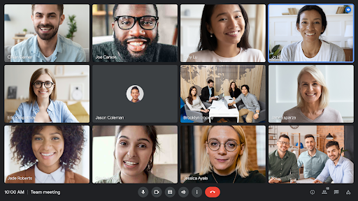
- If you tap on your video feed, you’ll be able to select between a grid tile or a floating image. You can also reposition it or hide it to concentrate on the call.
- Your own view will appear in the bottom right corner of the grid, allowing you to focus on video feeds at eye level.
Improved viewing and presentation experience
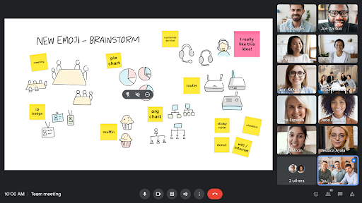
- You can choose not to pin content that others share; This allows you to view more video feeds and in larger sizes.
- Participant names will always be visible, regardless of the size of the meeting.
Optimized bottom bar
- We moved meeting dial-in codes, attachments, participant list, chat, and other activities to the bottom right corner to create more space to view content and people.
- Volume and other controls are consolidated in one place for easy access.
- The call abandonment button has been moved away from the microphone and camera buttons to avoid accidentally dropping a call.
- The bottom bar is always visible, but will not cover the subtitles or lower video feeds.
Additional improvements include the following:
- Now, when someone speaks, the outline of their tile will turn blue; This makes it easier to identify who is speaking, especially in meetings with more people.
- Mute indicators are smoothed, helping to reduce visual distraction.
- When there are more participants than can be displayed in a grid, a tile is added so you always remember who is on the call.
Improved viewing experience and optimized bottom bar in Chromebase for meetings
Improved presentation experience in Chromebase for meetings
Visual update for Google Meet hardware kits
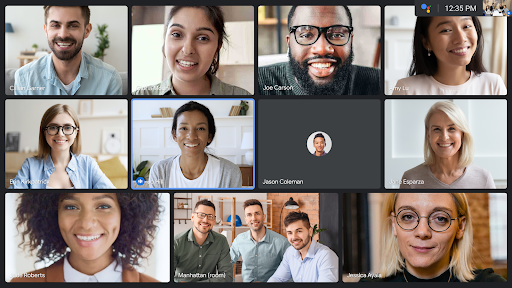
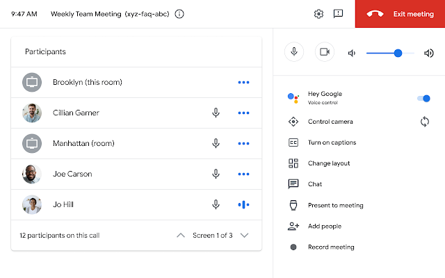
As we aim to provide a consistent Google Meet experience, you’ll see tiles with rounded corners, all text in Google’s Sans font, and the new color scheme on TV screens and touch controllers on all Google hardware kits. Google Meet. Please note that for hardware kits, the self view is always displayed in the top right corner and currently cannot be removed or resized.
Visual update for Google Meet hardware kit screens
Visual update for Google Meet hardware touch drivers
Who is affected by the change?
End users
Why use it?
These changes will provide a consistent experience for Google Meet no matter where you join a meeting from or how you join it. Additionally, we hope that features like the reorganized bottom bar, grid layout, voice prompts, and more will make it easier to interact, share information, and collaborate with your meeting participants.
Additional details
In some cases, your own view might appear with gray bars at the bottom and top to show you everything your camera sees. Other participants may see a cropped version of your video feed.
How to get started
- Administrators: There is no administrator control for this feature.
- End users: End users do not need to take any action; These improvements will be available by default on Meet hardware devices.
Throwing rhythm
- Fast and Scheduled Release Domains: Gradual release (up to 15 days for feature visibility) a starting July 7
Availability
- Available to all Google Workspace customers using Meet hardware devices.


